Biscoito Podcast | Branding
PT
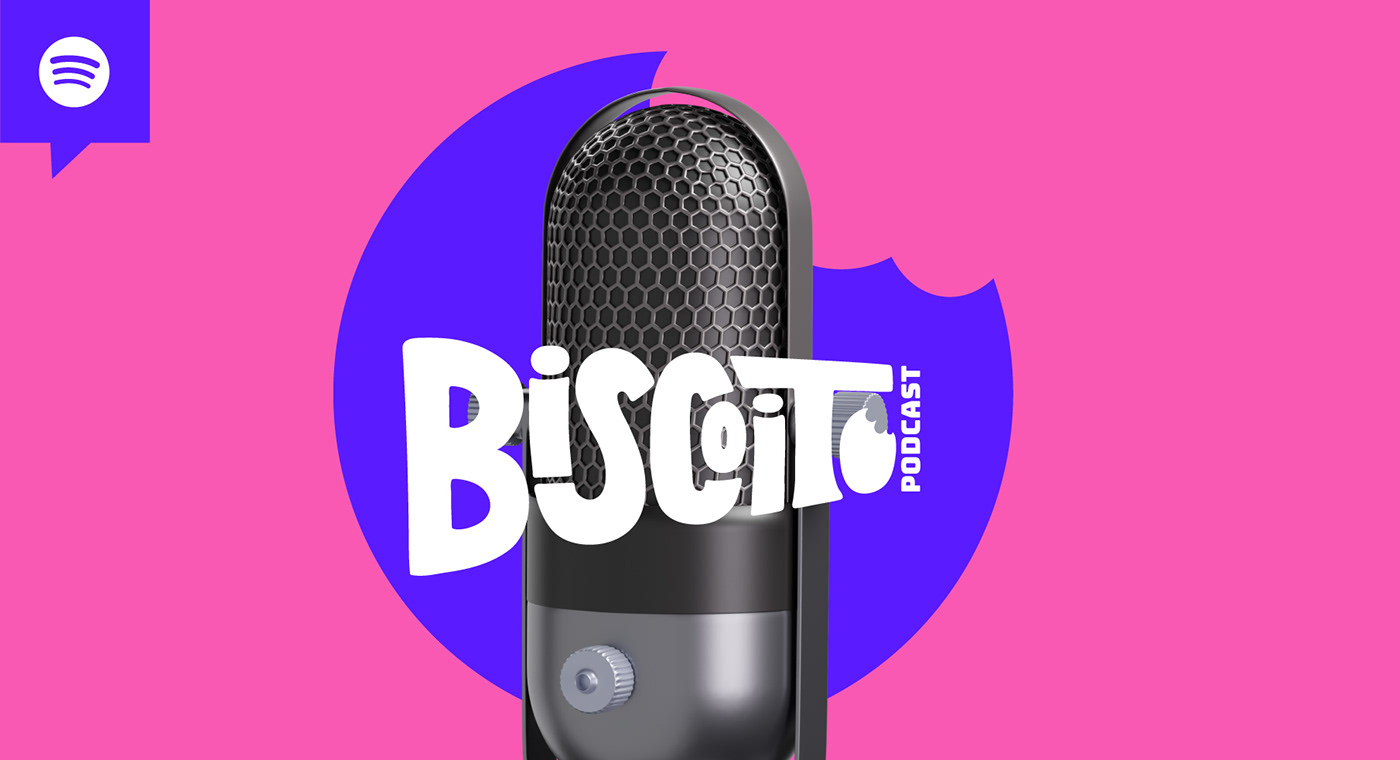
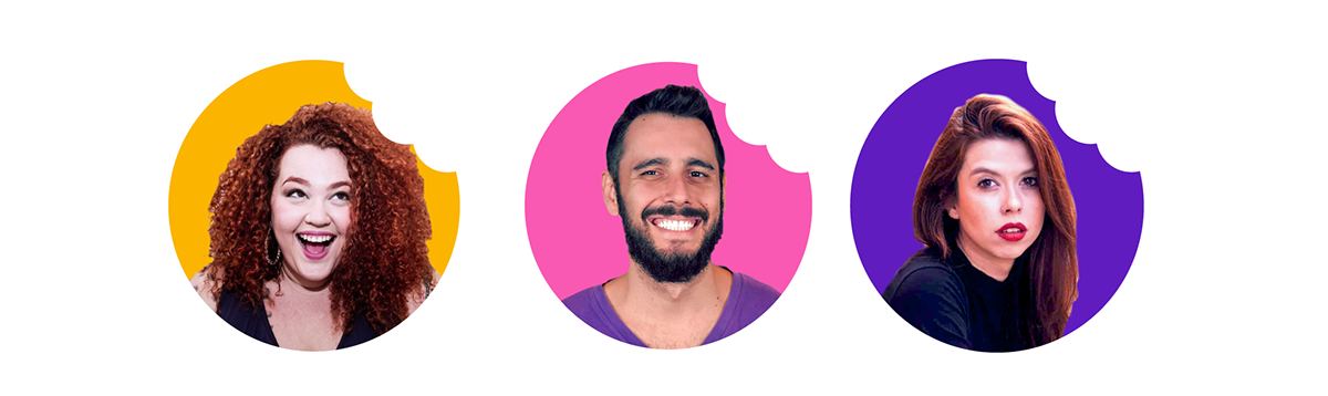
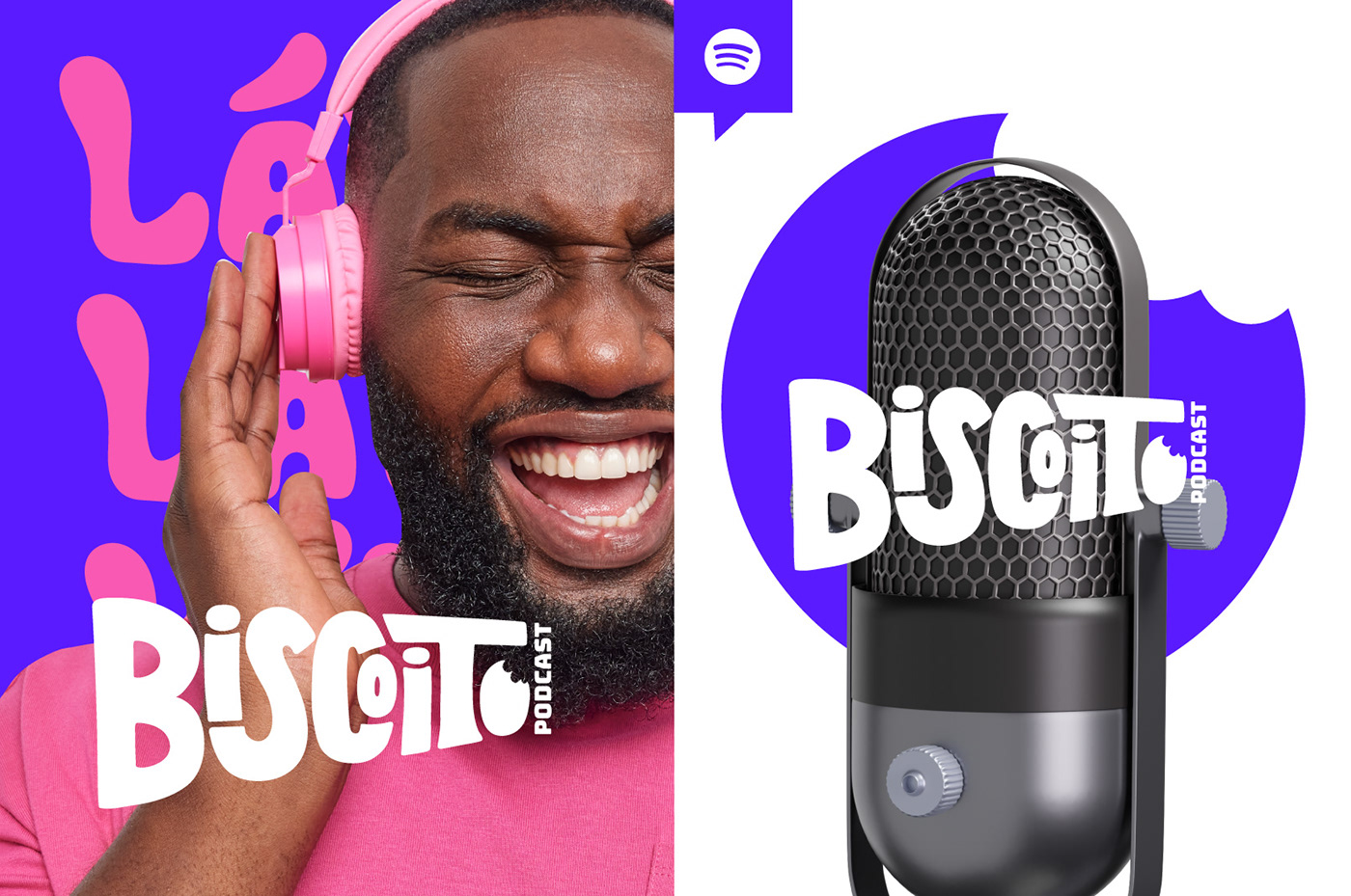
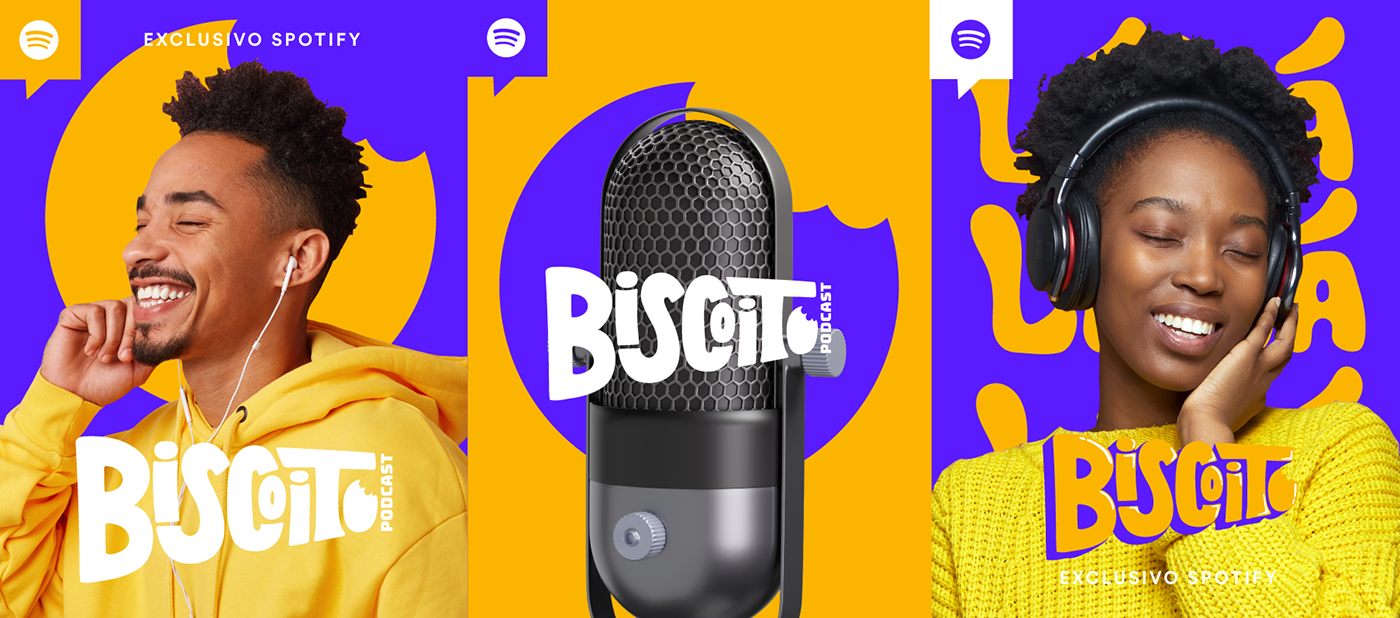
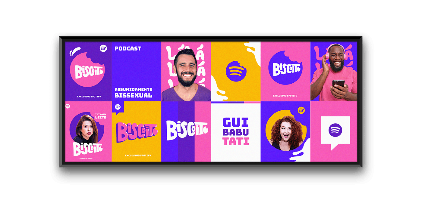
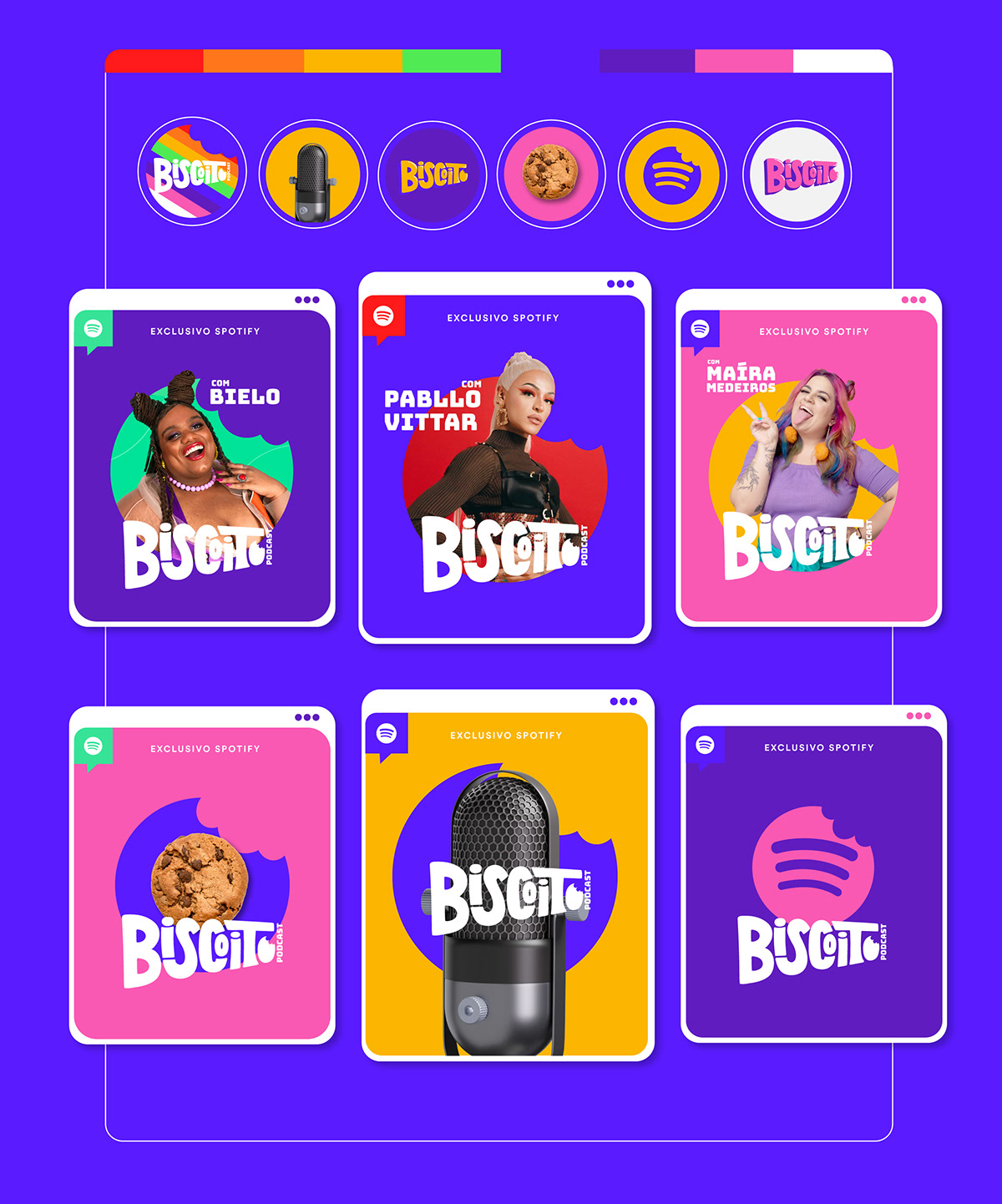
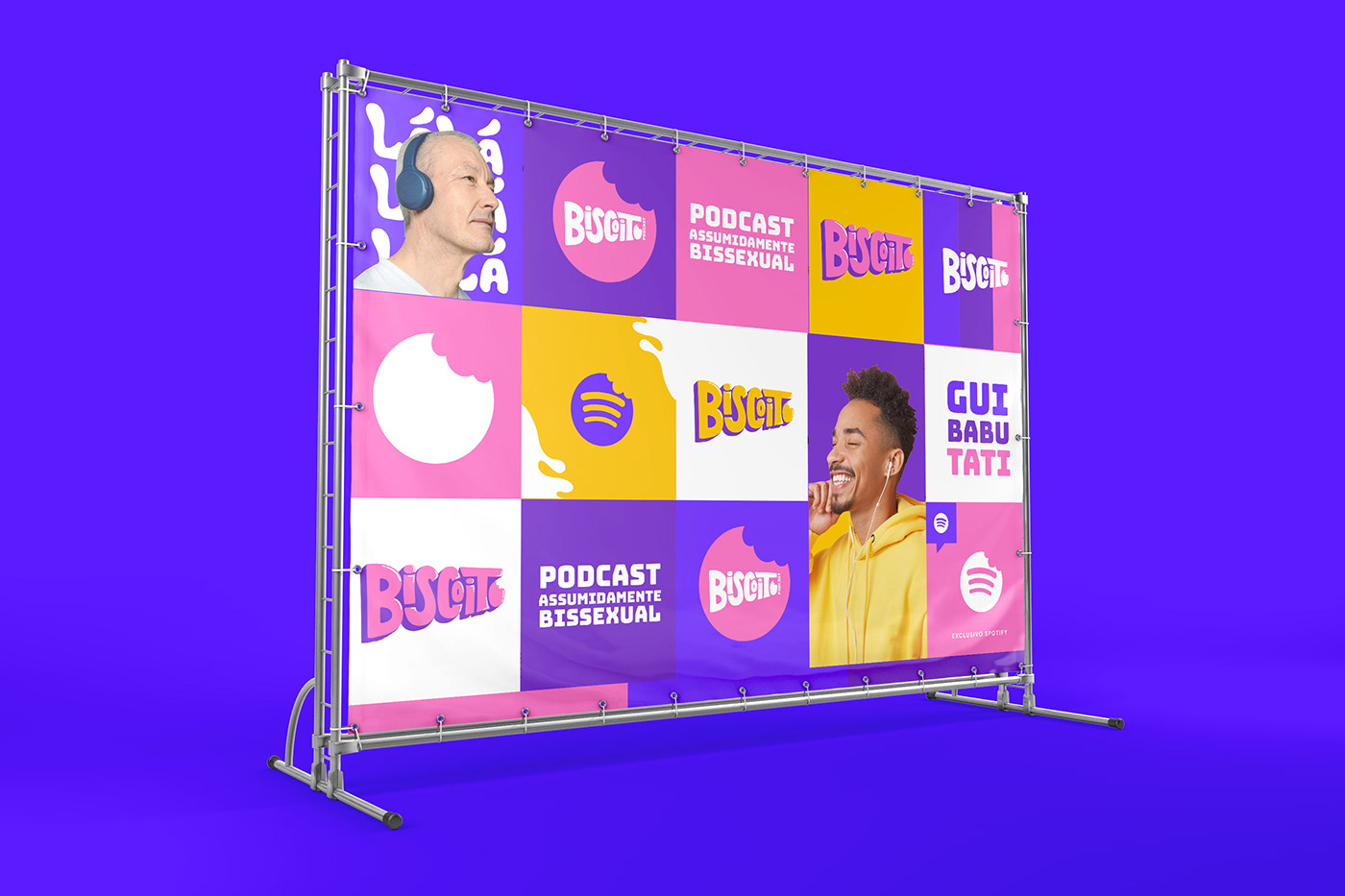
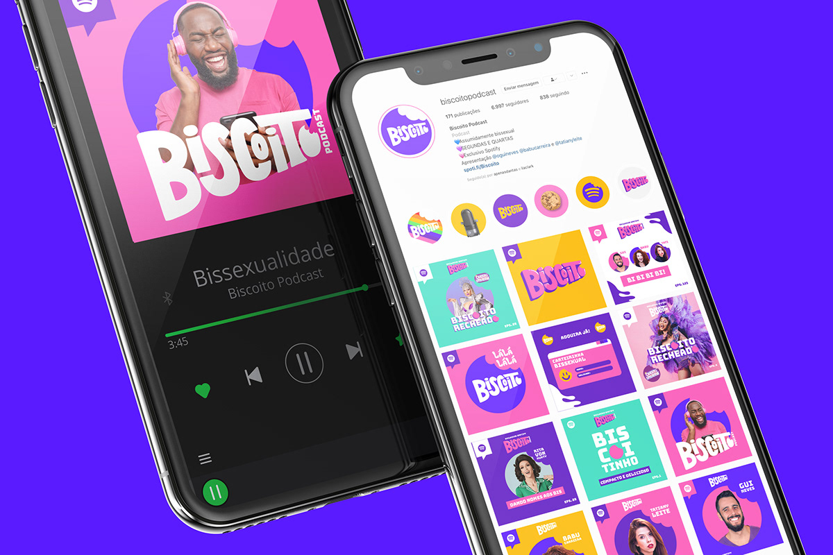
Biscoito Podcast é uma marca com personalidade e identidade assumidamente bissexual. Trazendo referências do Design Fun, a identidade apresenta o universo divertido, transmitindo a sensação do Podcast, debatendo assuntos de forma leve mas com seriedade. Juntando 3 mentes brilhantes, o espaço sobre bissexualidade e temáticas da cultura LGBTQIAP+ é apresentado por Babu Carreira, Gui Neves e Tatiany Leite. São exclusivos do Spotify, com episódios todas segundas e quarta.
EN
Biscoito Podcast is a brand with an openly bisexual personality and identity. Bringing references from the Design universe, it presents the fun, conveying identity and the feeling of the Podcast, debating subjects lightly but seriously. Bringing together 3 brilliant minds, the space on bisexuality and LGBTQIAP+ culture themes is presented by Babu Carreira, Gui Neves and Tatiany Leite. They are exclusive to Spotify, with every Monday and Wednesday.
Brand Concept
PT
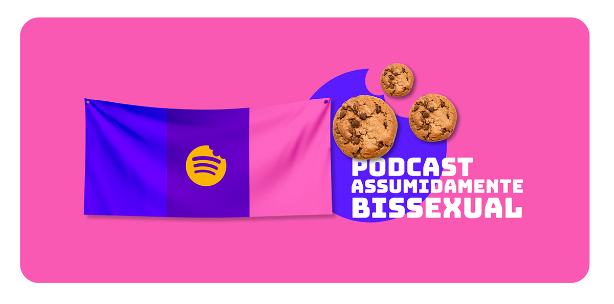
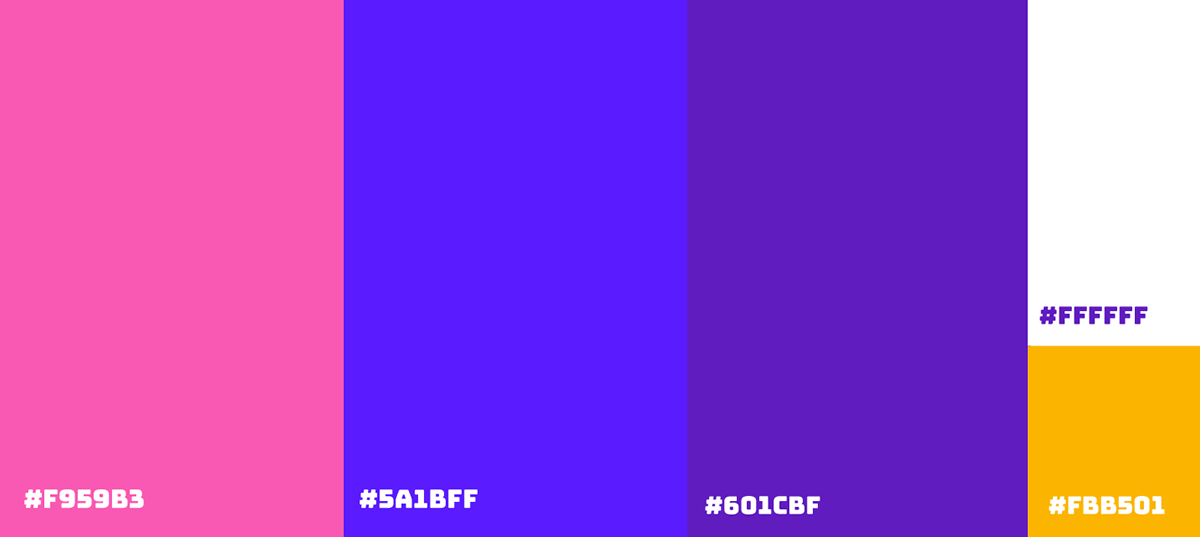
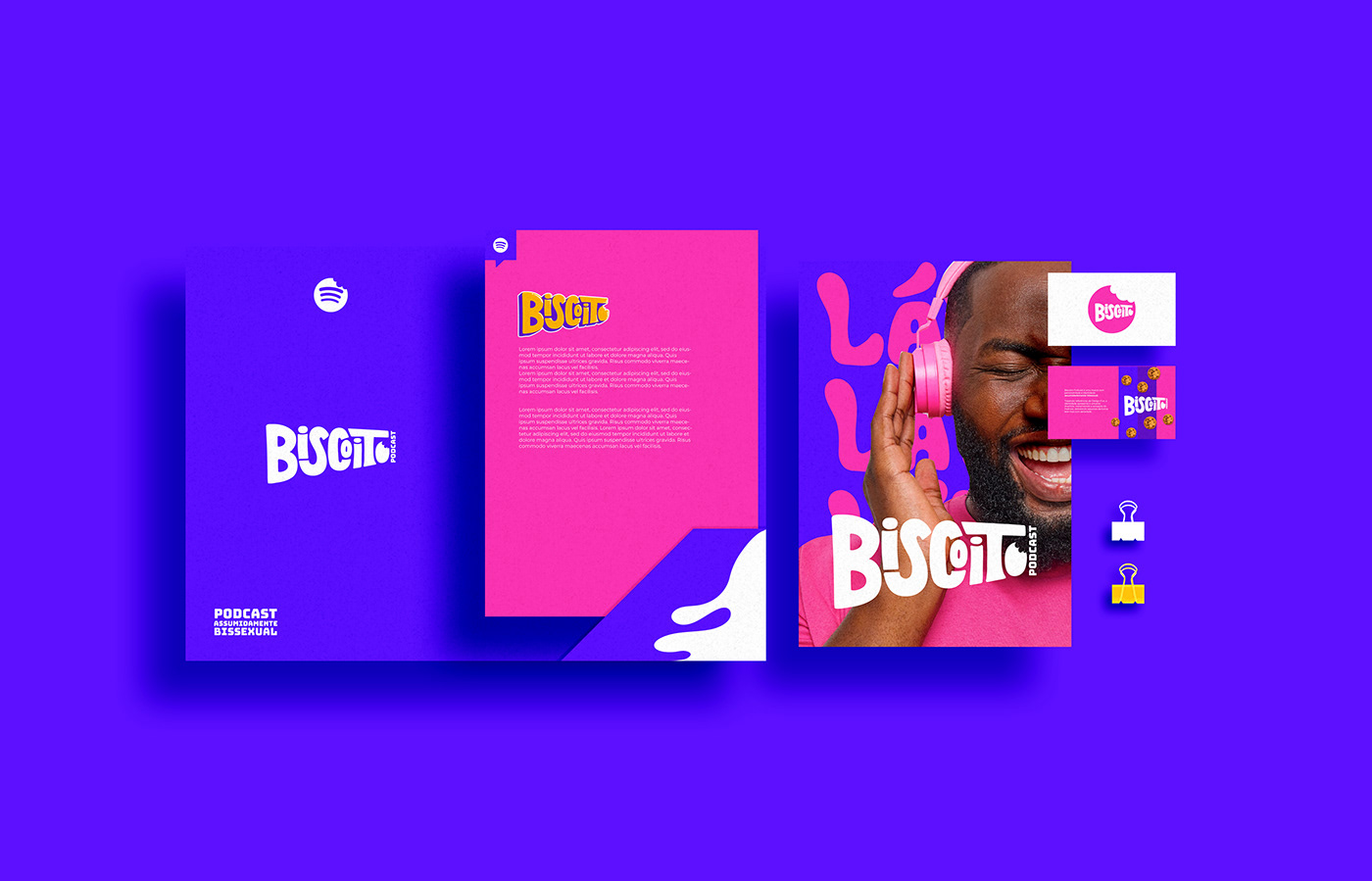
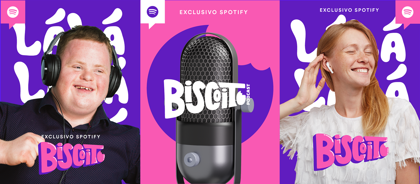
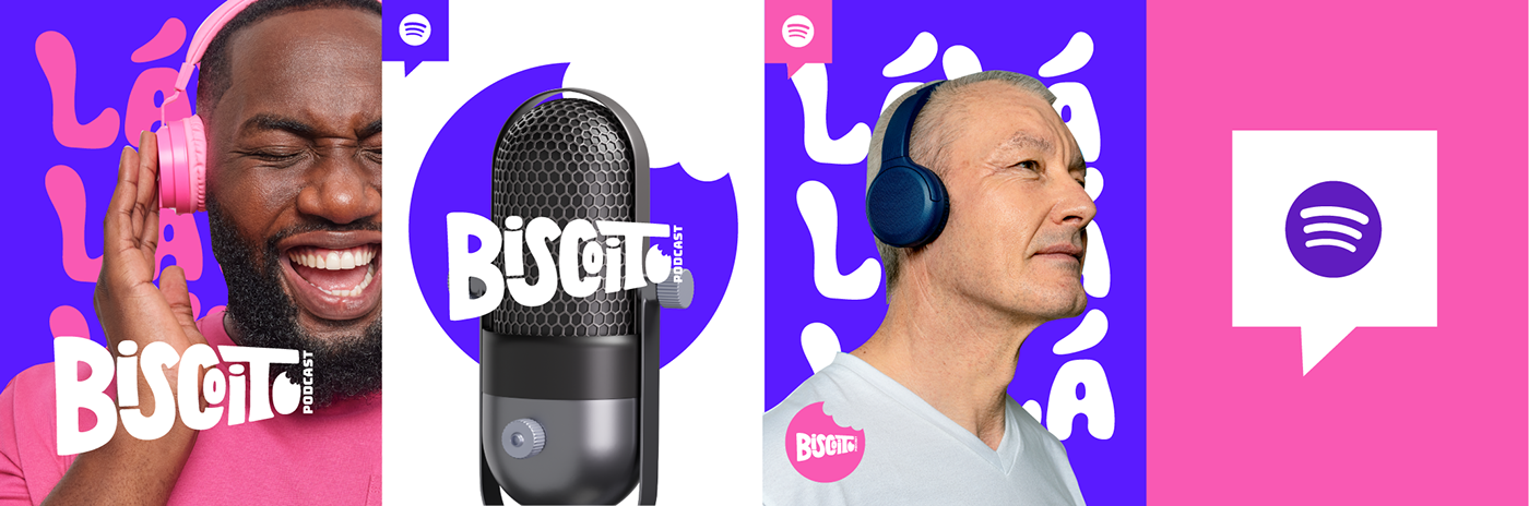
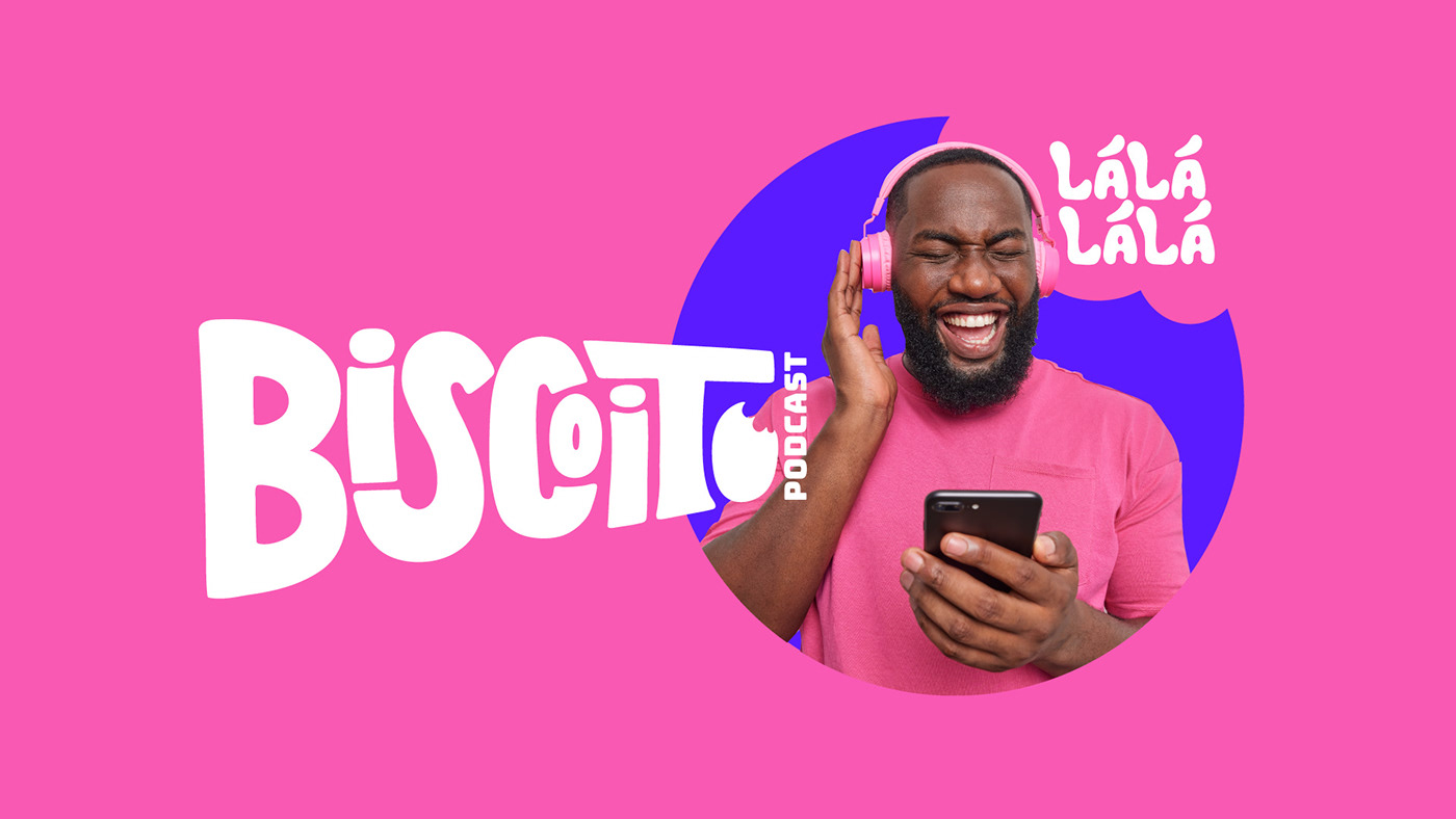
A marca possui o nome "Biscoito Podcast" provém de “O B não é de biscoito” dentro da sigla LBGTQIAP+, buscando ir contra o apagamento do movimento e satirizando. O perfil da marca é com foco na comunidade bissexual mas vai para além da sigla. Ademais, as cores da bandeira bissexual foram pontos chaves para o projeto seguido pelo símbolo do biscoito já presente na marca.
EN
The brand has the name "Biscoito Podcast" comes from "The B is not a cookie" within the acronym LBGTQIAP+, seeking to go against the erasure of the movement and satirizing. The brand profile is focused on the bisexual community but goes beyond the acronym. In addition, the colors of the bisexual flag were key points for the project, followed by the cookie symbol already present in the brand.
Colors and Typographic
PT
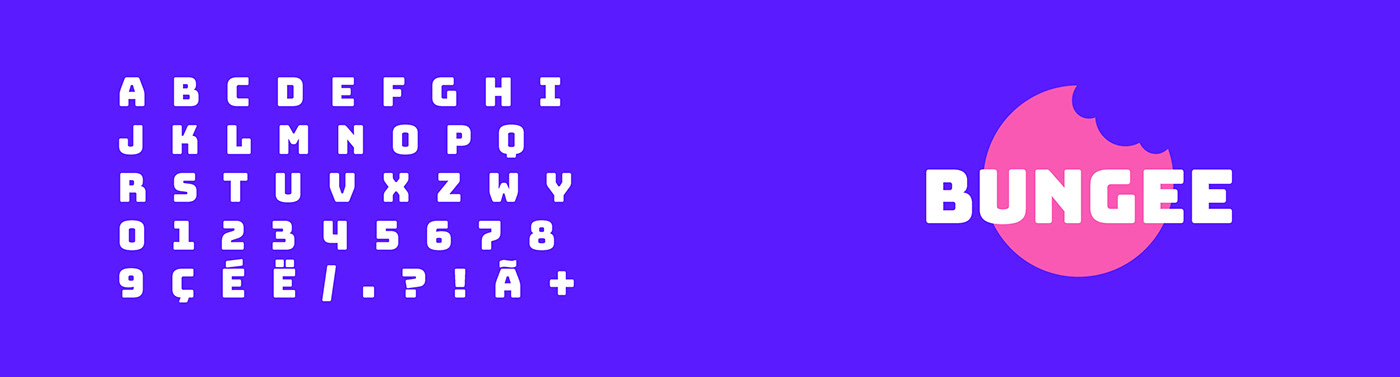
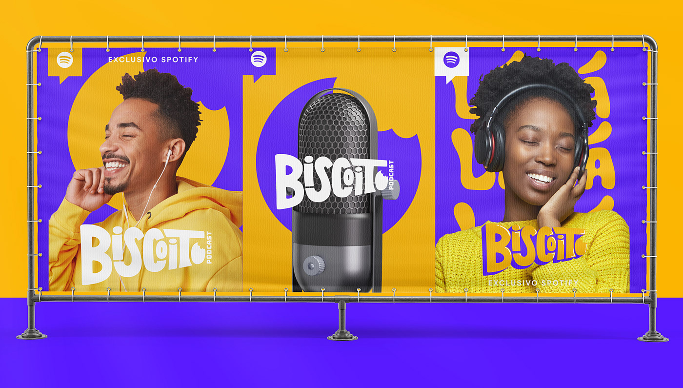
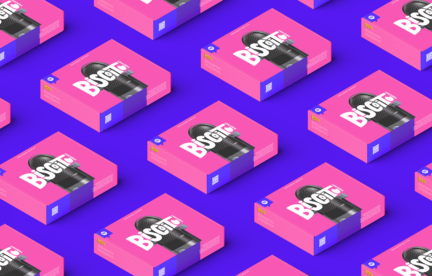
Seu principal elemento são as cores que devem ser usadas com foco onde as combinações da bandeira Bissexual tem maior destaque seguido pelo branco e amarelo acentuando as cores. Para títulos foi selecionado a fonte Bungee, com seu uso livre, a tipografia se adapta bem com o universo da marca. Para textos auxiliares, a fonte Montserrat, com sua família, se torna funcional para textos grandes.
EN
Its main element is the colors that should be used with a focus where the combinations of the Bisexual flag are more prominent followed by white and yellow accentuating the colors. For titles, the font Bungee was selected, with its free use, the typography fits well with the universe of the brand. For auxiliary texts, the Montserrat font, with its family, becomes functional for large texts.
Logo & Visual Identity
PT
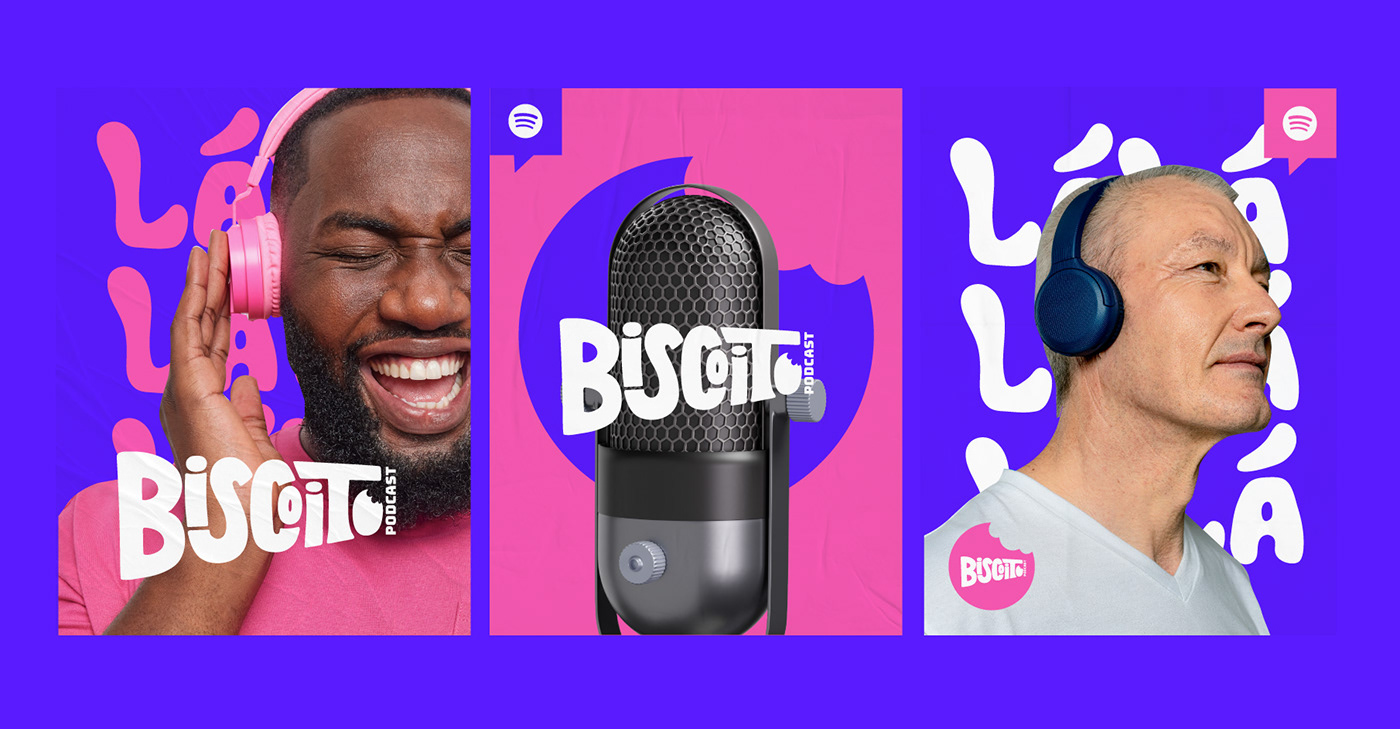
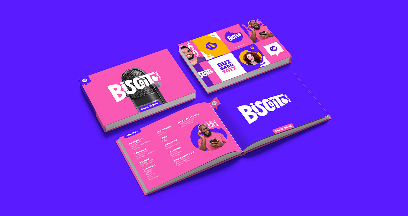
Para o logotipo foi desenvolvido de forma única por meio do lettering. As letras se encaixam de modo divertido e fora de um padrão visual. O logotipo preferencial segue com uma assinatura PODCAST, onde reforça o segmento da marca. A visão de composição visual da marca apresenta os mais diversos elementos como logotipo e suas versões, tagline, grafismo e fotografia.
EN
For the logo, it was developed in a unique way through lettering. The letters fit together in a fun way and out of a visual pattern. The preferred logo follows with a PODCAST signature, which reinforces the brand's segment. The brand's visual composition vision presents the most diverse elements such as logo and its versions, tagline, graphics and photography.


✦ Obrigado por assistir
Thanks for watching ✦